
White

As an artist, I typically exhibit my work on white gallery walls, a common practice that has become an established norm in the world of visual art. The aesthetic of using white walls in galleries and exhibition spaces became particularly prominent around the early 20th century, largely as a reaction to the increasing prominence of abstract art. Abstract art, with its non-representational forms and experimental approaches, requires an environment where the focus remains entirely on the work itself. White walls, often perceived as neutral and unobtrusive, help achieve this by minimizing distraction from the artwork. They allow the viewer to engage with the paintings, sculptures, and installations without the visual noise that might come from an overly textured or vibrant background.
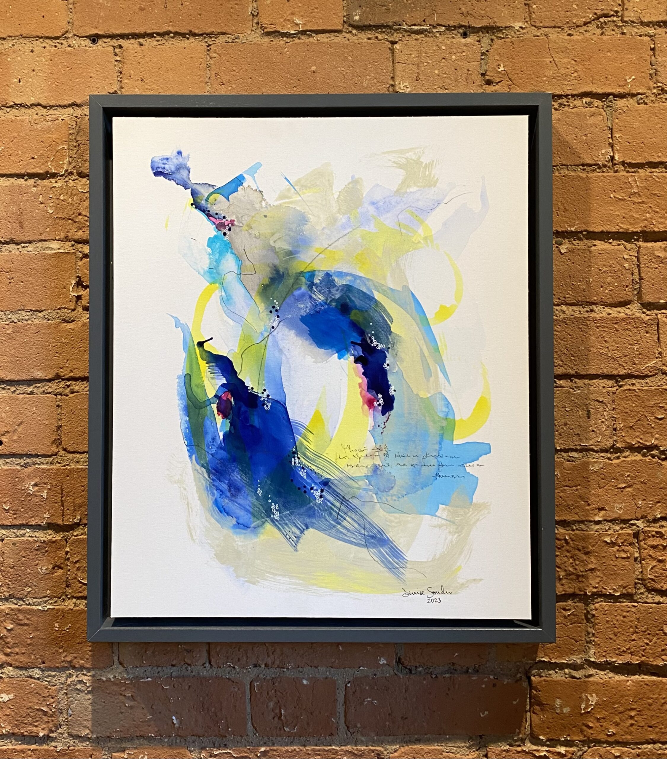
However, the colour and texture of the walls in a gallery or exhibition space are not simply incidental. They can significantly affect how a work of art is perceived and understood. While white has become the default in modern galleries, it’s worth considering that other wall surfaces can also play an integral role in shaping the viewer’s experience of the artwork. Textured walls, for example, introduce an element that extends beyond the artist’s direct control and can have surprising and powerful effects on the final display. I’ve had first-hand experience with this during my last exhibition where the background wasn’t the clean, sterile white of traditional galleries.
My work was displayed against a terracotta brick wall. The interaction between the artwork and the wall was fascinating. The textured brick created an organic energy that seemed to complement and amplify the work. The paintings, in particular, seemed to find a natural “home” on this kind of surface. They didn’t just rest passively on the wall; they felt as though they belonged to that specific environment. The warmth of the terracotta contrasted with the tones of my paintings, producing a dialogue between the work and its setting that might have been absent if the paintings had been hung on a plain white wall. This experience led me to wonder whether the final exhibition space should be considered in the creation of the work itself. Should artists take into account the eventual placement of their paintings when designing and creating them? This question brings us to the broader notion of how space influences both the artwork and the audience’s interaction with it.
The size of a painting can influence the way it interacts with the environment. Large-scale artworks, such as those measuring 150 cm x 100 cm or more, dominate the space they occupy. These works become the focal point of the room, commanding attention and effectively asserting themselves as the dominant force within the space. On a white wall, such a painting stands out, its image the most prominent feature in the room. The large scale allows the work to engage with the viewer in an almost overwhelming way, drawing them in and immersing them into the piece. The size and scale of the artwork become central to its impact, especially when displayed on a neutral background where there are few other elements to compete for attention.
In contrast, paintings that are more modest in size, those that could be categorized as “manageable” in terms of scale, offer more flexibility in their display. These works can be hung in a variety of spaces, either as individual pieces or as part of a broader collection. The size of these pieces allows curators and artists to experiment with placement, grouping, and arrangement. It also means that the wall or surface on which the work is displayed plays a more pronounced role in the viewing experience. The eventual hanging of such works becomes an important consideration. This is where the colour, texture, and overall aesthetic of the wall can contribute to the work’s visual impact. A small painting on a bold or textured wall can present an entirely different visual experience than the same work on a traditional white gallery wall. The interaction between the artwork and its environment, in these cases, can make the difference between a harmonious display and a disjointed one.
This gallery wall discussion also touches on the broader field of cognitive psychology, an area of study that historically played a significant role in the presentation and exhibition of art. The psychology of colour, space, and perception has long influenced how we engage with art. One historical figure who explored this concept was Charles Eastlake, the first director of the National Gallery in London. In the mid-19th century, Eastlake initiated a dramatic shift in the way art was presented in galleries by introducing the use of red walls for displaying paintings. Before Eastlake’s intervention, gallery walls were typically painted in neutral, muted tones, such as greyish-green, which provided a soft backdrop for artworks. However, Eastlake’s decision to use red was based on his desire to create a harmonious interaction between the paintings and their surroundings. He believed that red would complement the gold frames and enhance the cooler colours that were prevalent in many paintings of the period.
Eastlake’s decision to introduce red walls was grounded in a desire to enhance the visual experience for viewers. By carefully selecting wall colours that would interact with the paintings’ colours and frames, Eastlake sought to create a more cohesive and balanced visual environment. This is an early example of how the colour of the wall can affect not just the aesthetic experience but the cognitive and emotional response of the viewer. Eastlake’s approach went beyond the surface-level aesthetics of the exhibition space; it was also about creating an environment where the viewer could engage with the artwork in a more thoughtful and meaningful way.
Eastlake also made significant changes to the physical layout of the gallery space itself. He moved paintings closer to eye level and reduced the clutter of overcrowded walls. Instead of filling the space from floor to ceiling with paintings, he spaced them out more carefully, creating a sense of order and allowing the viewer to engage with each piece individually. This was another important step in recognizing how space and presentation impact the viewer’s perception of art. The careful placement of art, coupled with the thoughtful choice of wall colours, set the stage for the modern gallery layout that we are familiar with today.
Today, many galleries opt for shades of off-white or pastel tones, such as pale yellows and blues, to provide a neutral but slightly warmer background for artworks. These subtle tones allow the artwork to stand out without overwhelming it. The choice of wall colour is therefore an integral part of the gallery experience. It’s not simply a background against which art is displayed, but a carefully considered element that contributes to the overall atmosphere and tone of the exhibition. The colour of the walls plays a significant role in shaping our cognitive and emotional response to the art in front of us.
When purchasing art, whether impulsively or after much consideration, the colour of the wall on which the artwork will eventually hang becomes psychologically significant. This consideration often goes unnoticed by the buyer, yet it has a substantial impact on how the art is experienced. The walls that surround the artwork affect its meaning, its emotional resonance, and the viewer’s overall perception of the work. The environment in which the artwork is displayed is not merely a backdrop; it is an active participant in the experience of art, influencing the viewer’s emotional response, cognitive interpretation, and the way in which the artwork is remembered long after the initial viewing.
To finish, the relationship between art and the spaces in which it is displayed is far more complex and significant than you might initially assume. While white walls have become the dominant standard in galleries and museums, other wall colours and textures can dramatically alter the viewer’s experience. This ongoing dialogue between the artwork and its environment continues to evolve, influenced by psychological, historical, and aesthetic considerations. As artists and viewers alike, we must remain attuned to the profound impact that the spaces in which art is displayed can have on our perception and understanding of the work.
If you have any thoughts on this, I would love to hear from you!
Substack: Denise Sowden